Problem
I recently was working on a reusable component that would ensure all tables in an app have the same look and feel. However, when it came to column headers I hit a blocker: there is no flexible width gallery out-of-the-box in Power Apps.

There are flexible height galleries, which you can find out more about here:
- Show items of different heights in a gallery – Power Apps | Microsoft Docs
- Gallery control: reference – Power Apps | Microsoft Docs
I wanted to create a reusable table header that could display column headers of varying widths depending on the data being displayed.
What about the Table control?
And yes, there is an out of the box data table control, but it offers limited functionality. For example, if you wanted to have icons or buttons for each row in your table, you would need to use a gallery, instead of the out of the box table control.
 vs the Data Table control")
Solution
While, it may be possible to solve this problem with a PCF component, I opted for a low-code solution using a standard canvas component stored in a component library.
")
Create a Component Library
You can see more about how (and why) to create component library in my Donut Chart blog post.
Build the Flexible Width Gallery Component
First, always give your component a meaningful name. I named mine cmpTableHeader
I recommend renaming your controls as you go. See the https://aka.ms/powerappscanvasguidelines for recommended naming conventions if your organization doesn’t have a naming convention yet.

I recommend setting default height for the component (it can be changed later). So I set the component Height to 80.

I might want to display text above the columns, so I’ll add a label.
I renamed the control lblTitle.

I set the Width to Parent.Width and the Height to Parent.Width/2 and the X and Y values both to 0


Optionally, I turned off Wrap so the text doesn’t wrap to a second line.

Then I added a horizontal blank gallery.

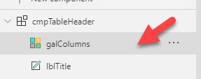
I renamed it galColumns.
Then I set the gallery’s width to Parent.Width and height to Parent.Height/2 and X to 0 and Y to the label height.


I don’t want the scrollbar to be visible, so I set Show Scrollbar to No.

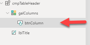
Then I added a button to my gallery.
I renamed it btnColumn.
I’ll set the button X and Y to 0 and the Height to Parent.TemplateHeight.

I don’t want there to be a border, so I set Border to None

Then I set Text alignment to Left

Then I set the Border radius to 0

Finally I set the galColumns Template padding to 0

Custom Properties
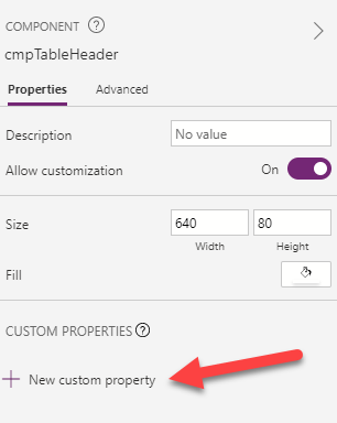
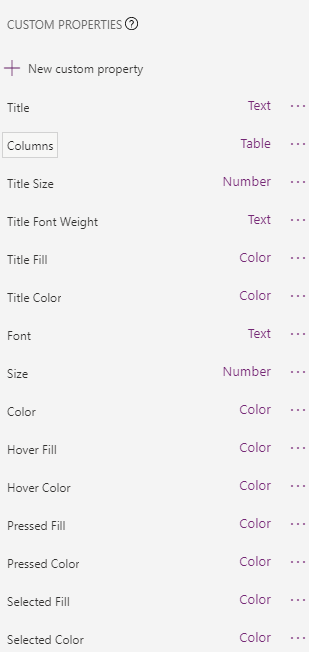
Now I need to create some Custom Properties to allow app makers to adjust this table header whenever they use it.
I’ll need the following properties:
| Property | Type | Default |
|---|---|---|
| Title | Text | Optional Table Title |
| Columns | Table | Table( |
Additionally, I’m going to add these optional properties. You can skip these if you prefer to hardwire your component’s look & feel:
| Property | Type | Default |
|---|---|---|
| Title Size | Number | 14 |
| Title Font Weight | Text | FontWeight.Semibold |
| Font | Text | Font.'Sans Serif' |
| Title Fill | Color | DarkBlue |
| Title Color | Color | White |
| Size | Number | 12 |
| Color | Color | Black |
| Hover Fill | Color | DimGray |
| Pressed Fill | Color | LightSlateGrey |
| Pressed Color | Color | GhostWhite |
| Selected Fill | Color | MediumBlue |
| Selected Color | Color | Ivory |
For more on Power Apps built-in colors: https://docs.microsoft.com/en-us/powerapps/maker/canvas-apps/functions/function-colors#built-in-colors
Connecting the Properties
Once I have the properties created, I can wire them up to the controls in my component
| Control | Property | Value |
|---|---|---|
| lblTitle | Text | Parent.Title |
| lblTitle | Visible | !IsBlank(Parent.Title) |
| galColumns | Items | SortByColumns( |
| btnColumn | Text | ThisItem.DisplayName |
You can skip the optional ones if you prefer to hard code your component’s style:
| Control | Property | Value |
|---|---|---|
| btnColumn | Font | cmpTableHeader.Font |
| btnColumn | Size | cmpTableHeader.Size |
| btnColumn | Color | If( |
| btnColumn | Fill | If( |
| btnColumn | HoverFill | cmpTableHeader.HoverFill |
| btnColumn | HoverColor | cmpTableHeader.HoverColor |
| btnColumn | PressedFill | cmpTableHeader.PressedFill |
| btnColumn | PressedColor | cmpTableHeader.PressedColor |
| lblTitle | Font | Parent.Font |
| lblTitle | Size | Parent.Size |
| lblTitle | Color | Parent.TitleColor |
| lblTitle | Fill | Parent.TitleFill |
Set Variable
I need to capture when the user clicks a column header and determine the state of the button (e.g. Sort Ascending or Descending). For this to work, I’m going to use a local variable. It’s local because it is only used inside the component. I can pass it out of the component using an custom output property (more on that in a minute)
When the user clicks the column header, the galColumns.OnSelect property will trigger the following code:
Set(
    locColumnSelected,
    If(
        //If current column is selected again, increment the ColumnState
        locColumnSelected.Name = ThisItem.Name And locColumnSelected.ColumnState < 2,
        {
            DisplayName: ThisItem.DisplayName,
            Name: ThisItem.Name,
            WidthPercentage: ThisItem.WidthPercentage,
            Order: ThisItem.Order,
            ColumnState: locColumnSelected.ColumnState + 1
        },
        // Until the ColumnState = 2, then reset locColumnSelected to empty
        locColumnSelected.Name = ThisItem.Name And locColumnSelected.ColumnState = 2,
        {
            DisplayName: "",
            Name: "",
            WidthPercentage: 0,
            Order: -1,
            ColumnState: 0
        },
        //If new column selected, set to currently selected column and set ColumnState to 1
        {
            DisplayName: ThisItem.DisplayName,
            Name: ThisItem.Name,
            WidthPercentage: ThisItem.WidthPercentage,
            Order: ThisItem.Order,
            ColumnState: 1
        }
    )
)
First, it checks of the currently selected column is the same one clicked and if the ColumnState is less than 2. If yes, it increments the ColumnState by 1.
If the same column is clicked three times (i.e. ColumnState = 2), then the formula resets the locColumnSelected to blank.
Finally, if a new column is selected, it sets locColumnSelected to that column and sets the ColumnState to 1 (i.e. Ascending)
This allows users to toggle the column selected for sorting in ascending or descending order.
Note: you may get errors with the code above.
If so, set the cmpTableHeader.OnReset property to the following code:
Set(
    locColumnSelected,
    {
        DisplayName: "",
        Name: "",
        WidthPercentage: 1,
        Order: -1,
        ColumnState:0
    }
)
Custom Output Properties
I need to surface two properties to the app so I can connect this component to a gallery in the app:
- Selected Column
- Sort Direction


)")
I’ll explain how to use them after I finish building the component.
Secret Sauce
Finally, it’s time to make this horizontal gallery a psuedo-flexible width gallery. In a perfect world, Microsoft would release a new control that does this out of the box, but as of today, we need do a little hack to get the column widths to vary dynamically.
The key is the WidthPercentage value stored in the Columns property of the component. Each column needs to have a percentage of the total width of the table and the total of all the columns’ WidthPercentage should equal 1 (a.k.a. 100%)
For example, if I have 3 columns, I can set the first column to .2, the second to .5 and the third must be .3. (.2+.5+.3=1)
I select the btnColumn and set the Width property to Parent.Width*ThisItem.PercentageWidth

Then I set the X property to Sum(Filter(cmpTableHeader.Columns,Order<ThisItem.Order),WidthPercentage)*Parent.Width

This takes advantage of the Sum() function which allows me to add all the column widths of the previous columns (i.e. anything less than current Order value) and multiply that by the Parent.Width to get the button’s X value.
Finally, I set the TemplateSize property to 1.

Final Touches
One thing you may notice is the first column is blue (or whatever SelectedFill color you chose)

I only want this to be blue when the user clicks the column, so I need to tweak my btnColumn Fill and Color properties:
")
")
And, if I don’t have text for the optional Table Title, I want the component height to be half as tall:
,40,80)")
Then I set the galColumns.Height to be the full Parent.Height when the Title property is blank, otherwise 1/2 the Parent.Height:
,1,2)")
Lastly, I set the galColumns.Y property to be 0 when the Title property is blank, otherwise the lblTitle.Height:
,0,lblTitle.Height)")
Making Connections
After I save the component, I can use it in my app with a gallery that has been formatted as a table. In this example, I’ll be using the SampleGalleryData that comes with all apps. If you need more robust sample data, I suggest Mockaroo.
I’ll add the gallery to my app and reformat it so each property is displayed in a row.
 formatted as table")
Then I added the cmpTableHeader component. I left the default colors and just update the Columns property to match my data source (i.e. SampleGalleryData).
Table(
    {
        DisplayName: "Sample Header",
        Name: "SampleHeader",
        WidthPercentage: 0.25,
        Order: 1,
        ColumnState: 0
    },
    {
        DisplayName: "Sample Text",
        Name: "SampleText",
        WidthPercentage: .75,
        Order: 2,
        ColumnState: 0
    }
)
Then I’ll update the galSample.Items property to sort the columns based on the cmpTableHeader component properties
SortByColumns(
    CustomGallerySample
    Coalesce(
        cmpTableHeader_1.SelectedColumn,
        First(cmpTableHeader_1.Columns).Name
    ),
    cmpTableHeader_1.SortDirection
)
Note: I included the Coalesce() function because I want it to default to the first column when no column is selected.
I recommend setting the labels in the galSample width to match the cmpTableHeader Column.PercentageWidth properties using this code:
Parent.Width*LookUp(cmpTableHeader_1.Columns,Order=1).WidthPercentage
Note: increment the Order=[#] for each column in your “table” gallery.
Optionally, you can set the gallery’s Y and Height to dynamically change based on the header component:


Note, if you don’t want a table title to appear, just delete the default Title text.

Summary
If you have any questions about this, please feel free to contact me here or on LinkedIn and Twitter. You can download a sample of this component on GitHub.
Very nice work! Thanks!
Nice & clean. Thanks!
You’re welcome!
Jamie, this is awesome. Thank you so much for your contribution!
Thank you!