The Problem

Jill (not her real name) wants to add a donut chart to her canvas app. Jill has some experience with Power BI and thought the solution might be a Power BI tile in her canvas app, but she ran into licensing issues because she doesn’t have a Power BI premium license. Next she went to the interwebs and found some code that let her build a dynamic SVG donut chart. She didn’t really understand the code and when it broke, she was stuck.
So I’m going to walk through how I would solve this. You may have a different approach and I encourage you to let me know here or on social media (LinkedIn or Twitter)
Don’t Reinvent the Wheel

I may say this a lot on my blog, but it bears repeating: don’t start from scratch if you can help it. The odds are someone has solved this problem or something close to it.
In our case, I’m starting with code developed by Microsoft MVP Vivek Bavishi (https://my.link.gallery/thatapiguy). He developed a donut chart example and posted it to GitHub (https://github.com/thatapiguy)
Importing the SVG Donut Chart
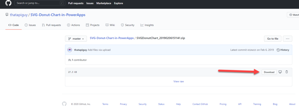
First thing, download the example SVG-Donut-Chart here: https://github.com/thatapiguy/SVG-Donut-Chart-in-PowerApps
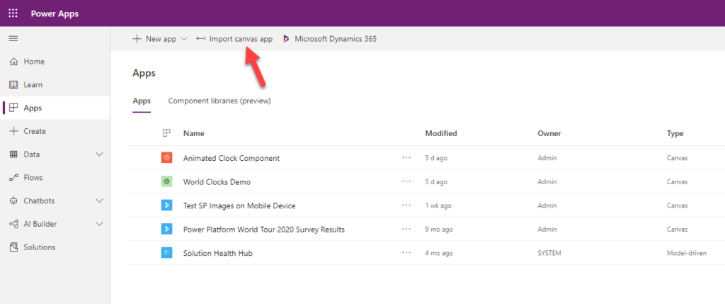
Then go into Power Apps (https://make.powerapps.com)
Click Apps
Click Import canvas app
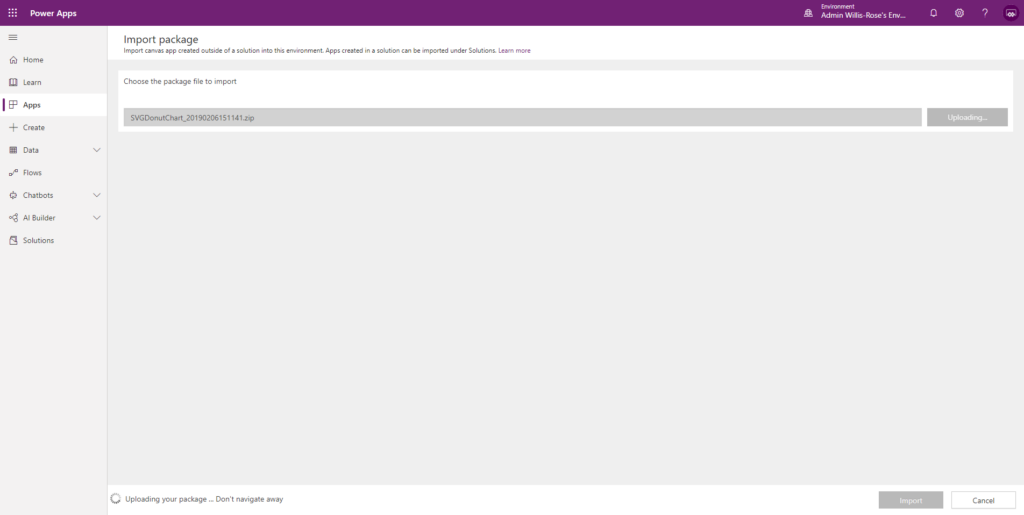
Click Upload
Select the zip file you just downloaded
Wait for the file to upload
Click Update
In the Setup dropdown, select Create as new
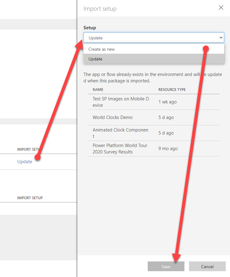
Click Save
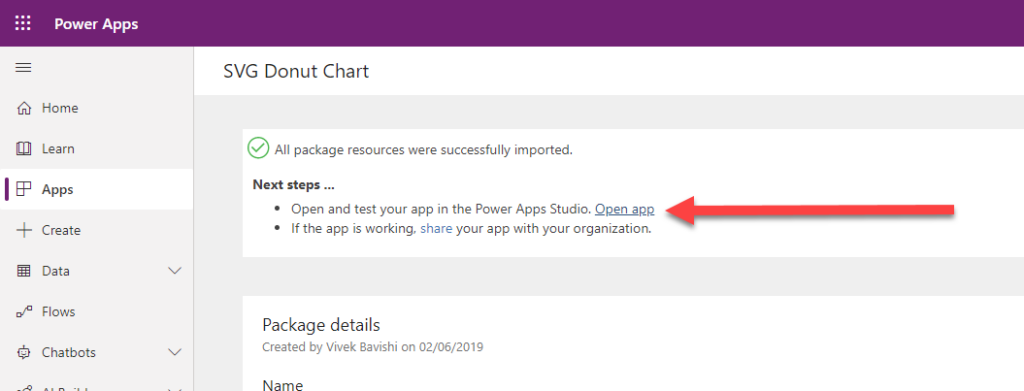
Click Import
Finally click Open App
Note you may get prompted with a warning about Preview features entering final validation.
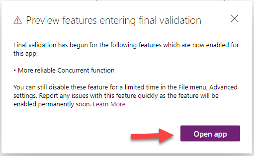
Click Open app
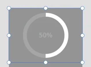
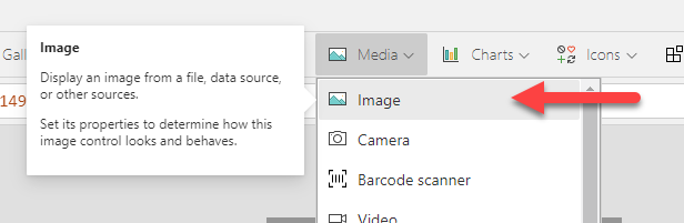
Using the SVG Donut Chart
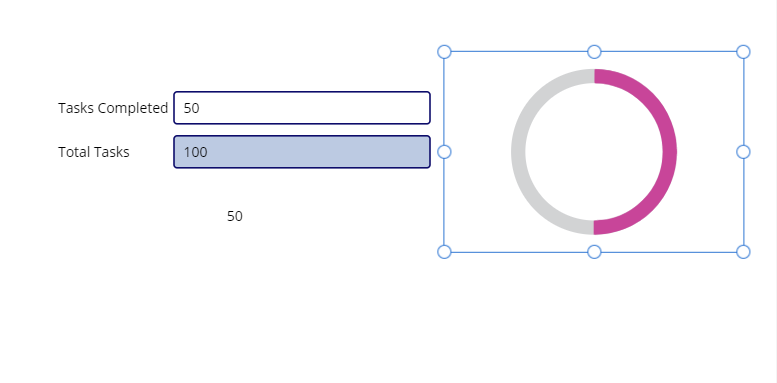
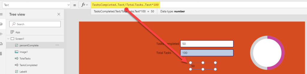
Vivek’s donut chart is pretty simple to use: enter two numbers: the number of Tasks completed and the Total Tasks and voila, the chart displays the percentage completed:

Jill took this example and added it to her canvas app. Problem solved right? Well, Jill wanted to customize the chart and she started playing with the code and she broke it.
I’m going to spend a little time explaining the code here, but if you want to skip ahead, we’ll be making this Jill-proof soon so she and others can easily reuse this chart without fear of breaking it.
What is an SVG?
SVG stands for Scalable Vector Graphic. It’s an open source standard based on XML (Extensible Markup Language) developed by the World Wide Web Consortium (W3C)
In short, you can create and edit SVG images in a text editor. This make them much smaller files and very easy to dynamically change (e.g. a donut chart in Power Apps)
For more on SVG: Scalable Vector Graphics – Wikipedia
SVG + Canvas Apps
There are some great resources out there for learning more about using SVGs in Canvas Apps. My favorite is Laura Graham-Brown’s Hat Full of Data blog. She has a great introduction to SVG + Canvas Apps (PowerApps – SVG Introduction – Hat Full of Data).
The most important take away:
- You can use an standard image control to display SVG code
- You can enter the SVG code into the Image property as text, but you must add a prefix code “data:image/svg+xml;utf8, “ and surround the <svg …></svg> code with the EncodeUrl() function EncodeUrl and PlainText functions – Power Apps | Microsoft Docs
“data:image/svg+xml;utf8, ” & EncodeUrl( “<svg…/> </svg>” )
You must replace all double quotes with single quotes in the SVG code
- Tip: use Notepad and press Ctrl+H to Find & Replace

Understanding the SVG Donut Chart Code
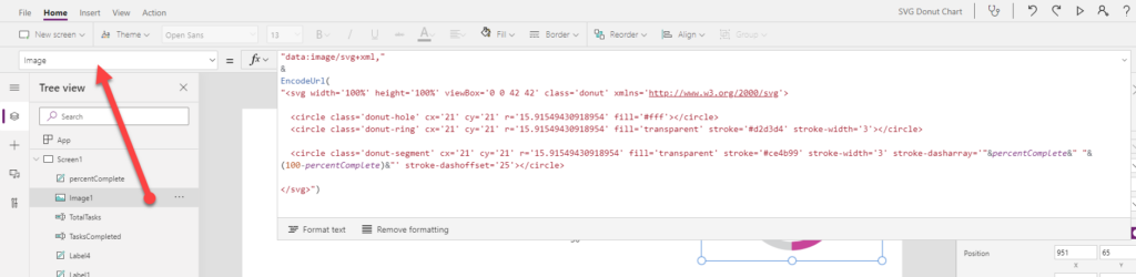
So let’s briefly dissect Vivek’s donut chart code so we can see what does what. First select the Image1 control
(Side note: See the PowerApps canvas app coding standards and guidelines (aka.ms) white paper for best practices with naming controls.)
Select the Image property if not already selected and expand the formula bar
First, note that there’s a height and width set to 100%.
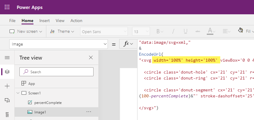
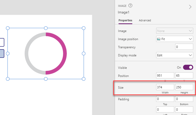
You might be tempted to change those properties, but there’s no need because the Image1 control height and width property will determine the size the chart on your screen
The really important code is the viewBox code. The viewBox attribute has four parameters: min-x, min-y, height and width. (viewBox – SVG: Scalable Vector Graphics | MDN (mozilla.org)). All the numbers that follow in the SVG relate to these four numbers.
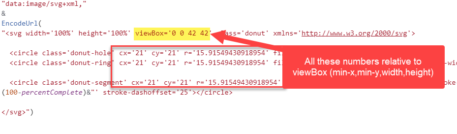
The first two are generally both 0, but you can change them if you want to crop your SVG. The last two determine the aspect ratio for the donut chart. In this case, both are equal so the aspect ratio is 1:1 or a square.
In summary, you don’t really need to change any of these attributes in the donut chart because again the size will be determined by the height and width property of the image control
Now let’s look the rest of the code. There are three <circle> elements. The first is the donut-hole, the second is donut-ring and the third is donut-segment. The class names have no effect on the chart, but are useful for understanding the purpose of each <circle> element.
The donut-hole and donut-ring circle have the same dimensions. There are three values you could change to adjust the size of your circle. cXand cY are the center of the circle relative to the SVG’s viewport (which is set by the viewBox attribute) . The rattribute is the radius. None of these need to be adjusted for the donut chart to work, but if you need more on the <circle> element: <circle> – SVG: Scalable Vector Graphics | MDN (mozilla.org)
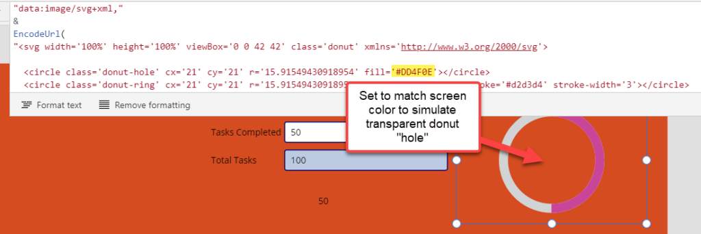
Donut-hole is the top most circle and has a fill property of #ffff (aka white). If you wanted match the inside of your circle to a different background color, you would need to change the fill property here. For example, if my screen color was orange (#DD4F0E), would set the fill property to #DD4F0E. For more Color Hex values: Colors HEX (w3schools.com)
The donut-ring <circle> element is transparent, but has stroke with two properties: stroke (color) and stroke-width. We could adjust the thickness of the donut chart by increasing or decreasing the stroke-widthvalue. Later I’ll show you how you can dynamically change the color of the donut chart. More on SVG Strokes: SVG Stroke Properties (w3schools.com)
The finale <circle> is the donut-segment. This is also transparent and has a stroke-width of 3. But there are two additional attributes stroke-dasharrayand stroke-dashoffset. You’ll note that stroke-dasharray has some dynamic values being passed into it.
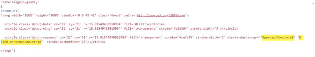
The stroke-dasharray is used to created dashed lines. Any array of column delimited values can be passed to this attribute. In the case of the Donut Chart, we only need two numbers: percentage completed and percentage NOT completed. e.g. If 25% completed, we entered stroke-dasharray=’25,75′
We can dynamically adjust these numbers by using the formula created by Vivek:
stroke-dasharray='”&percentComplete&” “&(100-percentComplete)&”‘
Note: in Vivek’s app, percentComplete is a label with the Text property set to this formula:
TasksCompleted.Text/TotalTasks.Text*100
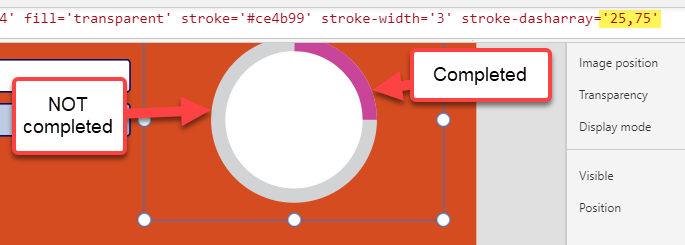
The final attribute in the donut-segment <circle> is the stroke-dashoffset which is set to 25. This is because the default starting point for a circle stroke is the 3 o’clock position. In order to set the starting point of the “completed” stroke, we need to offset the stroke by 25. You don’t need to adjust this property for your donut chart unless you want to start the “completed” stroke at different point on the circle.
Turn it into a Component

Jill, as a I mentioned, was well intentioned but accidentally broke her donut chart when she tried to adjust the SVG code. Let’s help Jill and other users in Jill’s organization by converting Vivek’s sample SVG Donut Chart into a reusable component.
Component Libraries
My advice: create a component library if you don’t already have one. Here’s more on component libraries: Create a component library for canvas apps – Power Apps | Microsoft Docs
To create a component library, go to make.powerapps.com
Click Apps
Select Component Libraries
If it’s your first component library, click Create component library
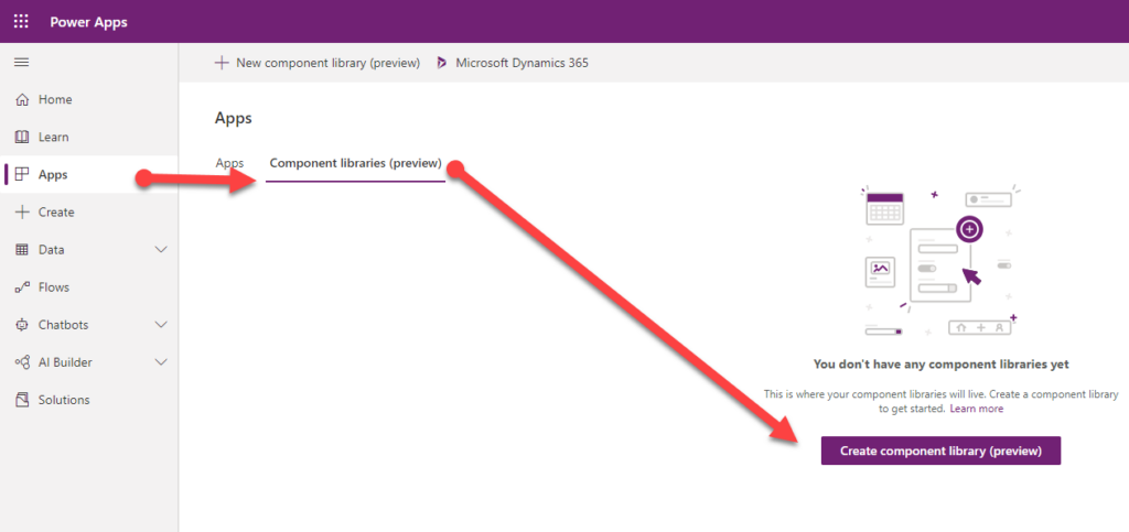
Note this feature is still in preview, so use caution when implementing in production.
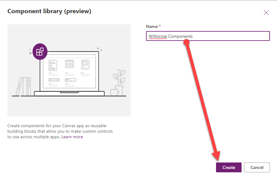
Enter the Name for your component library
Click Create
It will create an empty component called Component1
Copy & Paste
Did you know you can copy and paste controls in canvas apps? It’s a great way to save time and effort, if you already have work completed in one app and need it another, or in this case, a component library (spoiler: component libraries are a special type of canvas app)
So, let’s copy the image control from Vivek’s app.
Then go back to my component library and press Ctrl+V
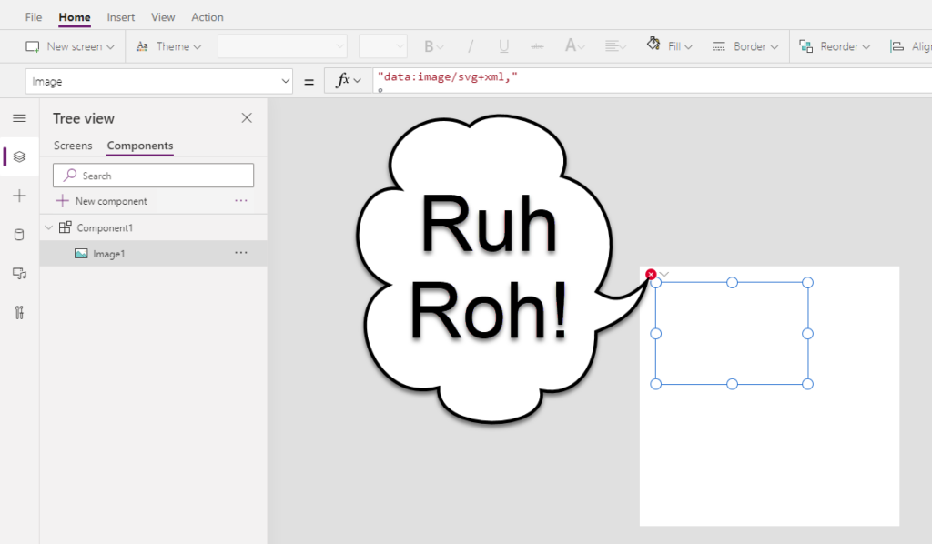
Ruh-roh! Yes, you’ll see a blank image control and the little red circle with an ‘X’ indicating there’s an error. Don’t fret, we just need to wire this component up a little differently than Vivek did.
Component Properties
Before I do, just a little background on components. They allow you to create reusable elements that can be centrally stored (and updated) in a component library so you can update multiple apps all at once. It’s a great way to enable citizen developers like Jill to add custom components to her canvas apps without worrying about users breaking the underlying code.
The key to do this is the use of custom properties. There two basic types: Input and Output properties. Input properties allow the app maker (e.g. Jill) to change the instance of the component in her app. e.g. Jill could change the color of the donut chart with a input property. The Output property allows the developer (e.g. you) to pass values out of the component as read-only values that the app maker (e.g. Jill) could use in their app. For example, you could output the percentage completed so it could be used in the app (e.g. in a label).
In order for this donut chart to work properly and be customizable, I need to create four input properties:
- Items Completed
- Total Items
- Completed Color
- Total Color
I’ll also add an output property:
- Percent Completed
To add a custom property, click the component (i.e. Comopnent1)
Click New custom property
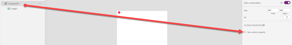
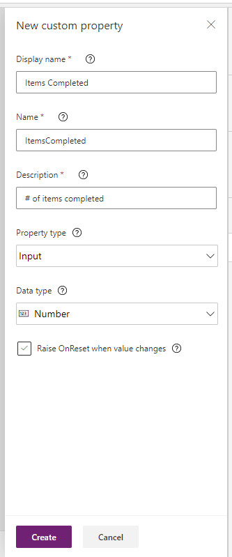
Enter the Display name (e.g. Items Completed)
Note the Name updates automatically.
Description is useful for helping app makers (e.g. Jill) understand what the property is for
Select Property type: Inputor Output
Then select the Data type.
Then click Create
Here’s a table with the values I entered:
| Display name | Name | Description | Property Type | Data Type |
|---|---|---|---|---|
| Items Completed | ItemsCompleted | # of items completed | Input | Number |
| Total Items | TotalItems | Total # of items | Input | Number |
| Total Color | TotalColor | Color hex value (e.g. #F6F6F6) of the donut chart (i.e. uncompleted items) | Input | Text |
| Screen Fill | ScreenFill | Pass the screen fill (hex code) into the app so the inner donut matches | Input | Text |
| Percent Completed | PercentCompleted | % of items completed (for use in labels and other controls) | Output | Number |
Note: there is a color data type, but unfortunately there is no way (as of today) to extract the color hex values from a Power Apps color value, which is what’s needed for the SVG code.
Default Values
Every custom property has default property. Let’s adjust the default properties for the properties we’ve created.
Select property (e.g. Items Completed)
Adjust the default. (e.g. 25)
For Percent Completed, let’s use a formula to return the percent completed:
(Self.ItemsCompleted/Self.TotalItems)*100
Note: we use Self in this context to refer to the component itself. More on Self here: Operators and Identifiers – Power Apps | Microsoft Docs
For Total Color and Completed Color, let’s use the color hex values in the svg code.
Select the Image1 control.
Find the donut-ring stroke value (e.g. #d2d3d4) and copy it
Then select Component1
Then select Total Color and replace “Text” with the color hex code
Repeat the steps for donut-segment and Completed Color (e.g. #ce4b99) and donut-hole and Screen Fill (e.g. #ffff)
Update SVG Code
Once you have the custom properties created and configured, we can update the SVG code.
Select Image1
Replace 2 instances of percentComplete with Parent.PercentCompleted
Then replace stroke=’#d2d3d4′ with stroke='”& Parent.TotalColor &”‘
Then replace stroke=’#ce4b99′ with stroke='”& Parent.CompletedColor&”‘
Then replace fill=’#ffff’ with fill='”& Parent.ScreenFill &”‘
Finishing Touches
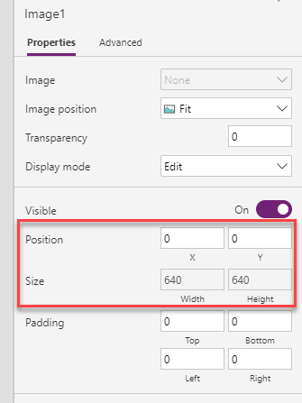
Next let’s set the height and width of the image control to equal the component height and width.
| Property | Value |
|---|---|
| X | 0 |
| Y | 0 |
| Width | Parent.Width |
| Height | Parent.Height |
Bonus Round
These next steps are totally optional, but might add value to the donut chart for app makers like Jill. Let’s add the ability to display the percentage completed as text inside the donut chart.
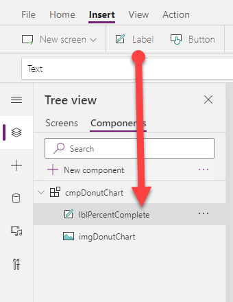
Start by adding a label
Let’s rename it lblPercentComplete
Next let’s set the x and y so it’s dead center.
Tip: to center a control on your canvas, use the following formula:
Parent.Height (or Width) /2 – [control name].Height (or Width)/2
e.g. lblPercentComplete.Y= Parent.Height /2 – lblPercentComplete.Height/2
lblPercentComplete.X= Parent.Width/2 – lblPercentComplete.Width/2
Then adjust the Width so the label is a percentage of the component width.
e.g. Parent.Width*.6
And set the Auto height to On
Then set the Text property to the following formula: Text(Parent.PercentCompleted,”#%”)
Set Text alignment to Centered
Finally, let’s give app makers like Jill the option to adjust this label
Let’s add two input properties:
| Display name | Name | Description | Property Type | Data Type |
|---|---|---|---|---|
| Font | Font | Various font properties include font family, size, weight and color | Input | Record |
| Show Percent Complete | ShowPercentComplete | Show or hide the percent completed | Input | Boolean |
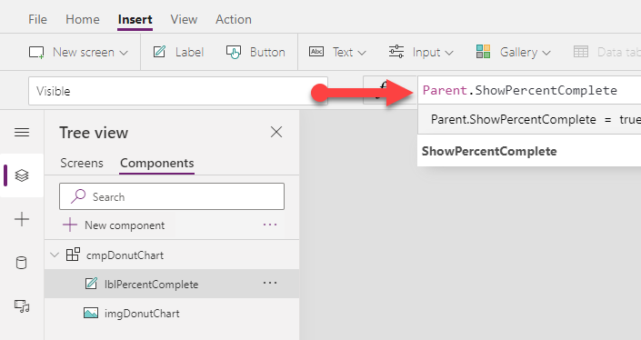
To use the ShowPercentComplete, select the label and the Visible property and change it from true to Parent.ShowPercentComplete
Passing multiple properties at once
While not always the best option, sometimes you’ll want to pass more than one value at time into (or out of) your component. You can use records or tables to do that.
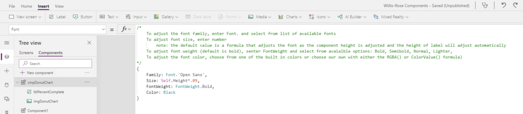
In this case, we want the app maker to be able to adjust the font family, font size, font weight and font color. You could create separate properties, but it’s hard to pass enumerated data types like Font or FontWeight through a text property, but extremely easy with a Record.
So select the Font property and let’s replace the default code with the following:
{
Family: Font.’Open Sans’,
Size: Self.Height*.09,
FontWeight: FontWeight.Bold,
Color: Black
}
Then we just need to wire it up to the label.
Select the label.
Then set the Font, Size, FontWeight and Color properties.
Note: you may want to add some comments to your code so app makers understand HOW to adjust the font family, size, font weight and color.
Test Your Component
Last but certainly not least, you should test your component to see if it behaves as expected.
You can do this directly in the component library.
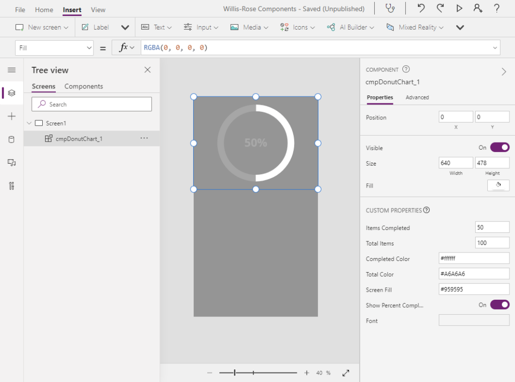
Select the Screens tab
Then select Insert
Then click Custom
Then select your donut chart component (e.g. cmpDonutChart)
Now you can see how app makers will be able to adjust this component in their apps.
Summary

After you publish your component library and share it with app makers like Jill, they will be able to add this donut chart to their apps and never need to know how it works. You can make more (or less) properties visible for them. For example, if you have a specified color scheme, you can limit app makers ability to change colors. Likewise with fonts and other properties.
Credits
Again, thank you to Vivek Bavishi and Laura Graham-Brown for their assist with this component.
If you’d like to download this component, it’s available in my GitHub here
Pingback: Power Apps Tip: Get Color Hex Code from a Color Value in Canvas App - Jamie Willis-Rose